
Copy Clarity 101: Turning Scanners into Subscribers
Pete and Tyler break down every touchpoint between a first-time reader and a paying subscriber: registration walls, subscription messaging, welcome emails, subscribe pages, and newsletters. Simpler wins at every one of them.

- Pete and Tyler walk through every marketing touchpoint between a reader landing on your site and becoming a paying subscriber.
- The mindset shift: you’re good at nuance, and that’s exactly what works against you in marketing copy. Digital audiences scan. Fewer choices and plainer words consistently outconvert more options and more nuance.
- One example from the episode deserves a case study of its own: swapping a single word on a free-registration prompt moved sign-ups by more than 50% in either direction. We’ve covered that test in detail separately, linked below.
- The rest of the episode maps five more touchpoints where simple beats clever: subscription messaging, welcome emails, subscribe pages, and newsletter structure and cadence, each with real examples from Salem Reporter, Small Boats Monthly, and Civil War Monitor.
Simple Beats Clever
You’re good at your job because you write content people want to read. That instinct for nuance is exactly what works against you once you switch to writing marketing copy.
Digital audiences scan. They’re moving fast, weighing a dozen small decisions at once, and giving your registration prompt or your pricing page a fraction of a second of real attention.
Nuance gets filtered out before it registers. Simple, direct language gets through. As Pete put it on this episode, it’s not that people are stupid. It’s that people are busy.
The same goes for choice. Publishers tend to hand readers more options, thinking it helps.
It does the opposite. Fewer choices convert better than more choices, almost every time.
One Word Can Move Sign-Ups by Half
A test on a Spain-based English-language newspaper’s free-registration prompt makes the point better than any advice could. Its message read “This story is free for you.”
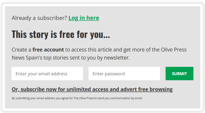
When the team swapped that line for the vaguer “Continue reading,” free registrations dropped by roughly half right away, then kept falling over the next two weeks. Reverting to language built around the word “free” sent registrations up more than 50% again.
We’ve broken that test down in detail in a separate piece, linked below.
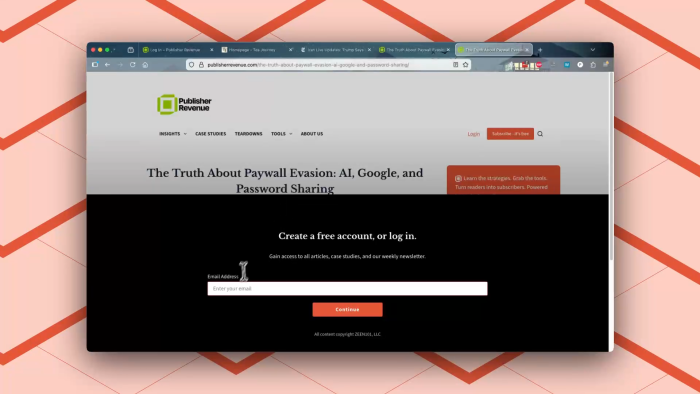
That lesson holds beyond one word. A registration wall requires an email address after a set number of free articles, instead of just asking for one, and the wording on that prompt matters as much as the mechanism behind it.
Publishers running this kind of wall through List Builder get the best results when the copy is specific. Tell readers three things clearly: that it’s free, what more content they’ll get, and what shows up in their inbox next. Vague, clever phrasing costs you sign-ups even when the offer underneath it hasn’t changed at all.
Bullet Your Benefits, Not Just Your Features
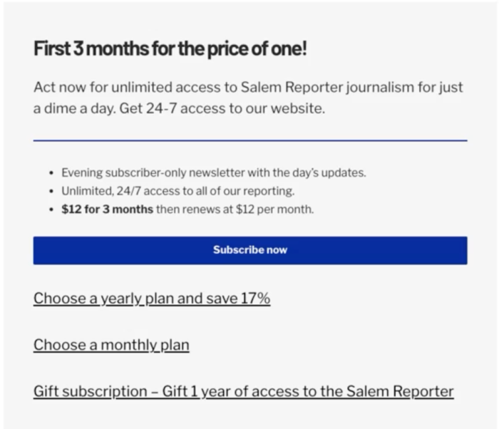
Once a reader is registered and back on your site, the next message they see is your subscription pitch. Salem Reporter’s approach is worth copying directly: short bullet points, each one written as a benefit, not a feature.
“24/7 access to breaking news” is a feature. “Stay informed with our award-winning coverage” is a benefit, because it tells a reader what it does for them.
“Help us hold officials accountable” asks the reader to do something. “Support transparent journalism” tells them what they get in return.
An ad-free plan is a feature. “Enjoy our clutter-free digital experience” is the benefit underneath it.
The distinction is not just wording. A benefit answers the one question every scanning reader is silently asking: what does this do for me?
Your Welcome Email Should Feel Like a Note, Not a Newsletter
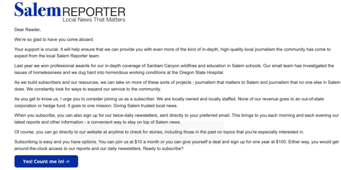
Salem Reporter’s welcome email for new free registrations is plain text, built around the publication’s mission, with one button at the bottom. That is the whole design.
Readers are used to heavily designed HTML emails by now, which means a simple, transactional-looking email actually stands out and reads as more important, not less. Keep your welcome email plain, and give it exactly one call to action.
The paid welcome email works the same way, with one addition. A new paying subscriber is in the best mood they’ll be in for a while, which makes it a good moment for one upsell.
Pick one: a donation ask, a gift subscription for a friend, an unadvertised coupon to pass along, or a group or corporate plan. Offering four things on a post-payment landing page gets you fewer of any of them.
One Subscription Card Beats Nine
Salem Reporter’s subscribe page has run largely unchanged for close to two years: one plan, one button, a plain text link underneath for the annual option, and a separate link for gifting. It’s a digital-only publication, which makes a single-card layout the easy call.
Small Boats Monthly does the same with two buttons instead of one: subscribe for yourself, or subscribe for someone else. That’s the entire decision a reader has to make on the page.
Print adds complexity, but the fix is the same instinct. Civil War Monitor runs three cards: print, digital, and all access.
A print-and-digital publisher with six geographic editions used the same approach. Three cards covered the real options (digital-only in one region, print-and-digital in one region, all-access across all six), and a less common plan like a two-year term became a plain text link underneath, not a fourth card.
The pattern holds across every example. Your cards are for your main offers. Anything else is a link, not a card.
Structure Your Newsletter the Way Small Boats Monthly Does
Small Boats Monthly’s free newsletter keeps it simple: a small, plain upgrade message near the top (“Subscribe today”), the actual content in the middle, and a bigger benefits block with one clear button near the bottom.
Readers who are only skimming still see the top message. Readers who make it to the bottom, meaning they read the whole thing, see the harder pitch.
Keep the whole newsletter inside a 20-minute read. That’s roughly the attention budget many readers actually have for it, and a newsletter stuffed with twenty or thirty articles blows past that budget before anyone gets to the part that matters.
Cadence matters as much as structure. If you send monthly, move to weekly. If you’re weekly, consider twice a week.
A daily news operation should be sending daily. Automation is what makes that realistic without adding to anyone’s workload: content goes out on schedule, and no one has to remember to hit send.
One publisher had never sent a single newsletter to its list of roughly 1,500 free registrations. After setting up an automated newsletter, about five people converted to paid plans from that very first send alone, with no extra effort beyond publishing what they already publish.
Key Takeaways
- Digital audiences scan. Nuanced, clever copy gets filtered out; simple, direct language gets through.
- Wording on your registration wall matters as much as the mechanism behind it. Specific, plain language about what’s free and what happens next outconverts a vague prompt.
- Write subscription messaging as benefits, not features. “What does this do for me?” is the question every scanning reader is asking.
- One subscription card for your main offer beats a page full of cards. Secondary plans belong in a text link underneath, not a card of their own.
- A newsletter that never goes out is a list sitting idle. Automation turns a dormant list into paid subscribers with almost no ongoing effort.
Try This Week
If you have a list of free, registered readers who have never received a newsletter from you, send them one this week. Even a single automated send can turn idle sign-ups into paying subscribers.
Watch the Episode
Resources Mentioned
