
The Registration Pop-Up Test That Crashed Sign-Ups 75%
A publisher swapped one phrase on their registration pop-up. Daily sign-ups crashed from 40 to 10 in hours. The full breakdown, the benchmarks, and a framework you can copy.

Case Study Summary
- Publisher: European niche news publisher
- Tool: List Builder (free registration wall plugin)
- Challenge: Find a quick conversion win for a new investor
- Solution: A/B tested the registration pop-up headline
- Result: Confirmed “FREE for you” beats “Continue Reading” by 4x. Sign-ups stayed at 40+ per day after reverting, with one day hitting nearly 70.
A European publisher changed one phrase on their registration pop-up. Daily sign-ups dropped 75% within hours.
The bigger story sits underneath the result. Most publishers undervalue their registration wall, and small copy decisions on that asset move bigger numbers than most teams realize.
Here’s what happened, why it happened, and how to apply it to your own site this week.
The Setup
A new investor joined the publisher’s team. The growth crew needed a quick win to show momentum.
They picked the registration pop-up. The publisher was running an older version of List Builder, our free registration wall plugin. It’s the lightweight wall that asks first-time readers to create a free account after their first article. With hundreds of daily visitors hitting it, even a small lift in sign-ups would compound across email, repeat traffic, and ad impressions.
The asset was already converting well. The question was whether they could squeeze more.
The Test
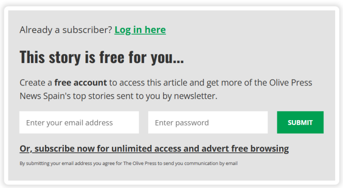
The original headline read “This story is FREE for you.” Direct. No ambiguity.
The team wondered if softer language might feel less salesy, so they swapped it for “Continue Reading…”
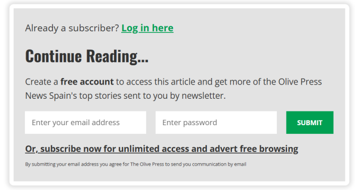
Everything else stayed identical: design, placement, timing, post-signup flow. One variable, one phrase.
The test ran for two weeks.
What Happened
Within hours of the swap, the numbers fell off a cliff.
- Daily sign-ups dropped from 40 per day to 10
- The registration form still loaded
- Readers just stopped handing over their email
That’s a 75% drop from a single word change.
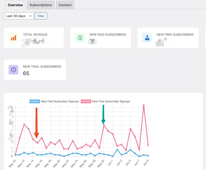
After two weeks of watching sign-ups stay flat at the new low, the team reverted to “FREE for you.” The recovery was immediate.
- Registrations returned to 40+ per day
- One day hit nearly 70 sign-ups, a new high
This wasn’t random variance. The only changed element was that one phrase.
Why “FREE” Beat “Continue Reading”
Registration is an exchange. The reader gives you an email. You give them access. Small doubts kill that exchange.
“Continue Reading…” sounds friendly. It also asks a question the reader can’t answer without thinking: what am I signing up for? Is there a cost? Will my inbox flood? Even if those doubts last a half-second, that’s enough hesitation to lose them.
“FREE for you” answers the question before they ask it. The promise is on the table. No cost, no risk, no fine print to inspect.
Three behavioral patterns explain the size of the gap:
- Loss aversion. Anything that hints at giving something up (money, time, attention) triggers caution. “Continue Reading” reads like a transaction whose price hasn’t been disclosed yet.
- Ambiguity aversion. Readers will skip a decision they can’t model quickly. “FREE” makes the decision instant.
- Specificity wins. Concrete language is more believable than vague language. “FREE for you” is concrete. “Continue Reading” could mean anything.
The lesson isn’t that “FREE” is a magic word. The lesson is that clarity converts. Anywhere you ask a reader to do something on your site, the headline has one job: make the decision instant.
Your Registration Wall is Your Most Undervalued Asset
Most publishers think paywall when they think conversion. Paywalls get the attention. They have the dollar signs attached.
The registration wall sits earlier in the funnel and asks for less. It collects no money. It asks for an email and a confirmation. And more readers hit it than will ever see your paywall.
Here’s why that matters.
Piano’s 2022 Subscription Performance Benchmark Report found that registered readers convert to paid subscribers at roughly 9.88%. Anonymous readers convert at 0.22%. That’s a 45x lift, just from moving someone from “anonymous visitor” to “registered email on file.”
The registration wall is the step that moves a reader from one bucket to the other.
This is why we built List Builder. The job is narrow: convert anonymous readers into registered ones with the least friction possible. 800+ publishers run it, and the case study above is one of them. The headline test landed on a configuration List Builder makes easy to swap, which is exactly why the team caught the drop in days rather than months.
Think of the registration wall as the cheapest customer acquisition you’ll ever do. The reader is already on your site, already reading something they care enough to click on, and the only ask is an email address. Compared to paid social, search ads, or referral programs, the unit economics are different by orders of magnitude.
That’s why one word on this asset matters so much. A 75% drop in sign-ups doesn’t just cost you emails. It costs you the entire pipeline downstream.
The Math: What Bad Copy Actually Costs
This publisher was at 40 sign-ups per day. After the swap, 10. That’s 30 lost sign-ups per day.
Over the two-week test: roughly 420 emails that didn’t get collected.
Apply the Piano benchmark (9.88% of registered readers convert to paid) and that’s around 41 lost potential paid subscribers from two weeks of soft copy.
Now run the math forward. If the team had not noticed and not reverted:
- 30 lost sign-ups/day × 365 days = ~10,950 lost emails per year
- 10,950 × 9.88% conversion = ~1,081 lost paid subscribers
The dollar value depends on your subscription price. Run it on your own numbers. The point: copy on a registration wall isn’t a cosmetic decision. It’s a business decision with multi-year compounding consequences.
Five Headlines That Underperform (and the Fix for Each)
Pulling lessons from this test and from working with 500+ publishers on the Leaky Paywall platform, these are the patterns we see consistently underperform on registration walls.
1. “Continue Reading…”
The reader has to figure out the cost. If access is free, you’ve buried the lead. If access has a cost, you’ve made them work to find out.
Fix: “This story is FREE for you” or “Read for free, just create an account.”
2. “Subscribe to keep reading.”
Conflates registration with subscription. Readers assume payment and bail before they read the small print.
Fix: If it’s a free registration, never use “subscribe.” Use “register,” “sign up,” or “create your free account.”
3. “Sign up for our newsletter.”
Sells the newsletter, not the article. The reader came for the article. They don’t care about your newsletter yet.
Fix: Lead with the article. Mention the newsletter as a bonus, not the headline.
4. “Join the community.”
Friendly. Vague. Asks the reader to identify with a group before they’ve decided you’re worth the trouble.
Fix: Save community framing for after registration, when they’ve already opted in.
5. “Get full access.”
Better than vague. Still abstract. “Full access to what?” is the next thought.
Fix: “FREE access to this story” is the specific version. Pair it with what they’re already reading.
The pattern: every underperforming headline asks the reader to make a decision before they have the information they need. Every high-performing headline gives them the information first.
A Framework for Your Own Headline
Before you publish the copy on your registration wall, run it through three filters.
1. Is the price disclosed? If access is free, the word FREE should appear in the headline. If access has a cost, say so. Don’t make readers guess.
2. Is the benefit specific? “Continue reading this story” is specific. “Get more from our site” is not. The reader is on this article. Speak to this article.
3. Can the reader decide in two seconds? Read the headline out loud. If you’d hesitate, they will too. Cut words until the decision is instant.
A headline that passes all three rarely loses to a softer alternative.
What to Test Next
Once your headline is doing its job, the next gains tend to come from four places. Each one is a setting inside List Builder, so the test is mostly a matter of changing the config and watching the numbers.
Form fields. Email-only converts higher than name + email in most tests we’ve seen. If you can defer collecting the name to the welcome email, do it.
Timing. Most publishers default to triggering the wall on article 1. The average session on a news site is around 1.7 pages, which means article 2 catches readers who are engaged but not fully committed. Worth testing.
Button copy. “Get this story free” tends to beat “Sign up.” “Read for free” tends to beat “Submit.” Specific verbs over generic ones, every time.
Post-signup experience. A confirmed email is just step one. What lands in their inbox in the first 48 hours determines whether they ever come back. Most publishers neglect this and wonder why their registered list doesn’t convert.
The bigger point: your registration wall is a system, not a single asset. Each element either reduces friction or adds it.
Takeaways
This is a one-publisher test. The principle behind it is universal.
- One word can move conversion by 4x. Audit the copy on your registration wall this week. If “FREE” doesn’t appear and access is free, that’s your first test.
- Clarity beats curiosity. Readers don’t click headlines that make them think harder. They click headlines that answer their question before they ask it.
- Measure daily. This publisher caught the drop because someone was watching. A monthly check would have cost them the bulk of the test.
- Treat the registration wall as a top-tier conversion asset. Paywall optimization gets the attention. Registration optimization usually moves the bigger number, because more readers hit it.
Run your own version of this test on your registration pop-up this week. Watch the daily numbers. The result might surprise you.
